Showing posts with label Statistics. Show all posts

COVID-19 Daily Update for Yesterday, 8/26/2020

Automation Update, Available Figures:

I am now automatically generating several figures each day and pushing them to an online "git" repository. I have had two volunteers offer to work on creating a web page that will provide a more useful interface to the figures/data. But for now, you can browse the figures with this link

There are several things available so far. 

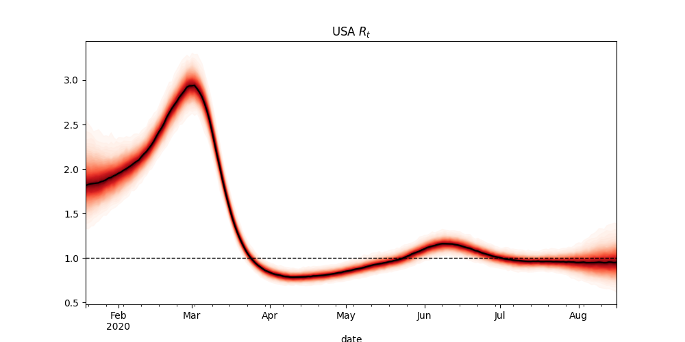
First, I am running the rt.live algorithm on the US as a whole (which they don't do). There are some good reasons they don't do that (the US is a diverse place, and some areas are doing better than others). But for those interested in what their algorithm has to say about the US as a whole, I now provide that visual updated every day.


As I have previously discussed, I disagree with the conclusions of rt.live's algorithm. I believe they are FAR too aggressive in adjusting for testing rates, which causes them to assume that the first peak(in April) was much higher than the second (in July). I believe they were of roughly the same size. So I hope to eventually provide a modified version of this analysis that more accurately adjusts for testing rates. 

We are providing tests and cases for each state. As an example, here's New Mexico: 
For these figures, the scale is set such that the tests are at a scale 10 times that of the cases, therefore, if the cases are above the tests in the figure, then the percent of tests that are positive is over the danger zone of 10%. The goal is to keep the cases (orange line) well below the tests (blue line).
 
And finally, we are providing the % of tests that are positive information directly in its own figure. As an example, here is New Mexico again: 
Again, the goal is to keep the % positive rate below the danger zone of 10%. 

Because I am now producing these figures for each state every day, you can check your own state, without waiting for me to do one of my "daily updates" on the state you care about. 

This is all a work in progress, so hopefully the user interface for viewing all this data will improve substantially in the future. 

COVID-19 Daily Update for Yesterday, Tuesday, 8/25/2020

Is it Signal, or Is it Noise? (World Wide Trends Update)

We discussed these two charts a few days ago. But here's the update: 

The question at the time was whether the seeming uptick in the 7 day average of the daily change in new cases seen in the 7 day average was signal or noise, given that the 14 day average was still going down. 

As of today, the 14 day average is also going up. So for now at least, it appears that this metric is getting worse. 

However, it appears that much of this is driven by the change in recovery rates. The number of daily new cases appears to be slowly declining:

First Confirmed Case of Reinfection (Is that as Scary as it Sounds?): 

The first truly confirmed case of reinfection has now been reported from Hong Kong. Previous reports of reinfection may have been due to false positives, or to a test picking up on dead viral material, or from a resurgence of the previous infection. 

However, in this case, we know it's real. The RNA of the virus was sequenced from both infections, and it is clear that the second infection was both real, and different from the first. 

I have seen quite a few news stories, and/or posts on social media with people freaking out. 

What does this really mean? And should we be panicking? 

First, it doesn't mean that the virus has mutated enough to reinfect people. The mutations were enough to use RNA tests to show this was a different strain, but we have been tracking mutations of the virus, and using those to track the family tree of the pandemic from the start. There is no evidence (yet) that the virus is mutating in ways that help it to avoid immunity (like the flu does).

Instead, it would appear that the man's natural immunity simply decreased to the point where he could be reinfected. This is how most other corona viruses (like the corona virus versions of the common cold) end up re-infecting us. Meaning this was expected. The reinfection took place after four and a half months from the time of initial infection, meaning immunity likely lasts at least that long, and most likely longer on average, since this was the FIRST confirmed case like this so far. 

That we lasted this long is GOOD news. 

What is even more exciting was that his second case was completely asymptomatic. Meaning, that his immunity wasn't actually gone. While it didn't prevent him from being reinfected, it DID prevent him from getting ill with ANY symptoms the second time through. 

This is also good news, this is VERY good news. 

We also know that many of the vaccines currently in development appear to be producing a stronger, and longer lasting immune response than the disease itself. 

While this does mean that natural herd immunity is a losing strategy, we already knew that. By the time we could conceivably anything close to herd immunity levels of population immunity... that immunity would be going away for many, and things would just start over. Although the disease would likely be less deadly to may the second time around, this would make it impossible to prevent the elderly and/or vulnerable from catching the disease at least once, and that would mean an unacceptably large death tole. 

However, with a vaccine, things look very different. 

While this case of reinfection may mean that we will need a booster at 6 months, it does not mean that a vaccine would not work. And, with a vaccine, we could actually reach (and maintain) herd immunity levels such that we could allow people who are elderly and/or vulnerable to go back out into society with minimal risk of getting infected. 

The news articles sound scary... but I believe that this isn't actually bad news. 

COVID-19 Daily Update: Automation Progress Update:

COVID-19 Daily Update: Automation Progress Update:

Today is a model discussion day. I will give a pandemic status update tomorrow. 

I have been working recently on automating the process of gathering data every morning. Frankly, I'm surprised it took me this long. 

Previously I had been moving data to my spreadsheet from various sources by hand. For those interested, here's a link to my spreadsheet, with all my old data. 

As nice as it was to have all the data (and figures) in one place, where everyone could look at it, and intuitively see how I did any calculation... as I began to track (and correlate) a larger set of data, this became unwieldy, and simply took too much of my time. 

I spent yesterday and this morning writing python code to automate this process. 

For those interested, the code is available on github: https://github.com/jlc42/JLC-COVID-19-Tools

This is a very preliminary work in progress. Currently, it has scripts to gather data which I ca run each day. I still need to write some code to automatically parse some of the web pages I scrape. But at least the data is saved. (Some date, notably from Georgia and Texas goes away if you don't scrape it daily. Some of that data is saved each day by CovidTracking, but other bits are simply lost if I don't scrape it myself daily, namely the testing data on antigen tests or serology tests. Texas puts that in their spreadsheet, but only has the "daily" value for the antigen and serology tests there... so yesterday's numbers are 'wiped out' by tomorrow's numbers.)

I can now put that on a chron job, and have it run every night while I am sleeping, and the data will all be saved. 

Next I need to write some code to go through all the saved data, and organize it into the useful fields I track... that's a larger task, that will take a LOT of time. For NOW, I have it pulling down (and organizing) the US state data from CovidDTracking... and then building a single plot... 

So... after two days of work... drum roll please.... here's my single plot, automatically generated for me this morning: 

And there it is, in all its glory. Here's the same figure plotted from my spreadsheet: 

I happen to think the scripted python version looks better. 

Side note: things ARE improving in New Mexico, yes Tests are down along with cases, but that is because the DEMAND for tests is falling, as true infections fall... you can tell because the % of the tests that are positive is also falling. 

Back to automation... 

This single figure may not look like much, HOWEVER, with a simple loop, tomorrow I will be ready to produce this figure for EVERY state in the US. 

And with a little bit of additional work, some parsing and gathering of data from my other sources, combined into a single data-file, I will be able to do this for every country as well. 


The case data and testing data is already available from other sources, but the next step will be to do some of the unique calculations I sometimes do, like my estimates of the % infected, and % currently infected, etc. And that's where the real potential lies. At that point, I may want to think about hosting this somewhere where people can see updated estimates for all these quantities for whatever location they are in. 

COVID-19 Daily Update for Yesterday, Thursday, 8/20/2020

COVID-19 Daily Update for Yesterday, Thursday, 8/20/2020:

World Wide Trends in Brief:

Major world wide trends from my last update are largely continuing. 

Percent daily growth in active cases has been falling, but is now holding at around 0.25%/day:
There have been two days with large outlier reporting spikes that make interpreting the daily deaths difficult, but the trend seems to be down since late July:

Compilation of Data Sources: 

I am in the process of compiling some of the best computer readable data sources for COVID-19 modeling out there. This is a work in progress, but for those interested, here's a link to the document which will likely grow through time. Eventually I hope to wrote code to auto-scrape many of these resources, and I will provide a link to that code once it's available. 

If you are aware of a good data source that I have missed, leave it in the comments here, or feel free to send me an email, or yell at me on FB or Twitter. 

Mis: 

I apologize that today's update is short, I have both a paper deadline, and a deadline for a presentation both due tonight. 

COVID-19 Daily Update for Yesterday, Wednesday, 8/19/2020:

COVID-19 Daily Update for Yesterday, Wednesday, 8/19/2020:

Yesterday's update was a "model talk" discussion about problems with rt.live's approach to estimating Rt.

Today is a more traditional status update. 

World Wide Trends in Brief: 


World wide we are starting to see minor signs of improvement. 

Daily cases peaked at the end of July, and have been falling VERY slowly since then. Because recoveries lag, they have continued to climb over the same period:
However, the number of new infections is still larger than the number of new recoveries, which means that the change in the number of active cases is still positive, meaning that more people are sick today than yesterday. But that trend has been moving down over time:
For the world to recover, this trend needs to be negative, and then stay negative. But there are still signs of improvement. 

We can also see improvement in the daily deaths, which have also been trending down since the end of July: 

Can it be Done, Watching China, New Zealand, and South Korea:

We have been especially watching three countries: China, South Korea, and New Zealand to see if their strategies for dealing with the virus is viable. China used a totalitarian lockdown, South Korea used extensive contact tracing with only minor restrictions, and New Zealand "went hard and went early" (without China's totalitarian bent) to stamp out all local transmission before reopening completely. 

All three were initially successful. All three are now facing local outbreaks that are challenging their strategies. If we wanted to prove to the rest of the world that there were alternatives to our failed approaches, these are some important places to watch. 

China's approach of local lockdowns of the affected regions appears to be working: 
New Zealand's second lockdown with contact tracing also now appears to be producing improvements:  

South Korea is still struggling to get its most recent Fundamentalist Church Based outbreak back under control. But they did it once. Now we need to see if they can do it again. It's currently too soon to tell: 

Source, Data, and Graphs:

https://docs.google.com/spreadsheets/d/1qVOdkuQ1IQb8McLNoe3oiSrnU1gVj7X916dvpyZ-zZY/edit#gid=737858658


COVID 19 MODEL TALK, RT.LIVE IS WRONG:

COVID 19 MODEL TALK, RT.LIVE IS WRONG:

I've been doing daily COVID-19 updates on facebook for a while now, and decided to move them to my blog. 

Today is a statistics and modeling thing, so if that is not your "thing" I promise to do a "status update" tomorrow. And I'll start putting in the title which I am doing each day. 

So... rt.live is wrong: 

https://rt.live runs their algorithm on individual states, but never gives an average for the entire USA. It makes sense that they might not choose to do this, the outbreak in the US is quite diverse, and differs from place to place. But I think it's still a good idea to get the average over-all picture. 

Now that I have their code running on my local machine, I modified the code to run on the average for the US. The first two figures show my results. Remember, this is rt.live's algorithm, but run on data they don't normally show. 

The current estimate of Rt for the US is 0.96, with 80% intervals of 0.73 - 1.13. That seems reasonable. 

HOWEVER, their adjustment for testing rates is VERY aggressive. They estimate that cases were more than TWICE as high in April's peak as they were in July's second peak. 

I don't believe this is right. And if they get the case adjustment wrong, they will get their estimate of Rt wrong in general. I suspect that their CURRENT Rt is right, but their RT back in July is FAR too low. 

If you ONLY look at the daily death curve, you might suspect something like what rt.live is saying. BUT, if you look at the hospitalization curve, it is obvious that this isn't right. 

Instead... the case fatality rate has to be dropping. And that means that the second peak has to be at least as high as the first. I used to claim that the first was larger, because more people were being turned away at the hospitals, but after a conversation with  Youyang Gu over on twitter, I have changed my mind... a falling average age of infection means a lower fatality rate, but ALSO a lower hospitalization rate. And THAT would imply that the second peak should be LARGER than the first! 

Rt.live's second peak is not only not as large or larger than the first, it's MUCH smaller! This just CAN'T be correct. And that means that EVERYTHING else they are doing is also wrong. 

The last figure shows the range of ways that the case data (in blue) can be adjusted for tests. The red curve is Youyang Gu's adjustment (with the second peak much higher than the first). The Yellow curve is my adjustment, with the two peaks roughly equal in size based on the hospitalization data. (I now believe that Youyang Gu's estimate is likely better than mine). The green curve is from rt.live. Not only is it an outlier... it makes NO sense. 

Conclusion: rt.live is wrong. The way they adjust cases for testing rates seems to be FAR too aggressive. For their curve to be right, the Infection Hospitalization Rate (IHR) would have to be RISING DRAMATICALLY, while the Infection Fatality Rate would have to be staying the same. 

The reality is that both the IFR and IHR should be falling as the median age of infection falls, while the IFR should be falling faster than the IHR as treatments improve. 

To get a good and reliable estimate of Rt, I'm going to need to re-write the part of their code that adjusts for testing rates. 

(Here's a link to Youyang Ug's discussion of how he adjusts for testing rates: https://covid19-projections.com/estimating-true-infections/)

Groundhog's Day and the Meaning of Life

Yesterday was Groundhog's Day, the holiday where everyone waits with baited breath for a rodent to decide if it saw its shadow, and ther...