COVID 19 MODEL TALK, RT.LIVE IS WRONG:
I've been doing daily COVID-19 updates on facebook for a while now, and decided to move them to my blog.Today is a statistics and modeling thing, so if that is not your "thing" I promise to do a "status update" tomorrow. And I'll start putting in the title which I am doing each day.
So... rt.live is wrong:
https://rt.live runs their algorithm on individual states, but never gives an average for the entire USA. It makes sense that they might not choose to do this, the outbreak in the US is quite diverse, and differs from place to place. But I think it's still a good idea to get the average over-all picture.
Now that I have their code running on my local machine, I modified the code to run on the average for the US. The first two figures show my results. Remember, this is rt.live's algorithm, but run on data they don't normally show.
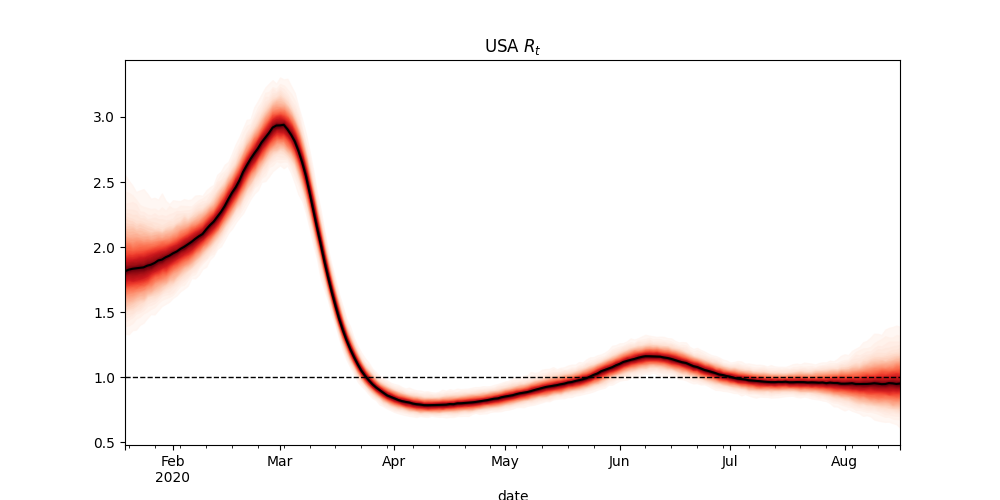

The current estimate of Rt for the US is 0.96, with 80% intervals of 0.73 - 1.13. That seems reasonable.
HOWEVER, their adjustment for testing rates is VERY aggressive. They estimate that cases were more than TWICE as high in April's peak as they were in July's second peak.
I don't believe this is right. And if they get the case adjustment wrong, they will get their estimate of Rt wrong in general. I suspect that their CURRENT Rt is right, but their RT back in July is FAR too low.
If you ONLY look at the daily death curve, you might suspect something like what rt.live is saying. BUT, if you look at the hospitalization curve, it is obvious that this isn't right.

Instead... the case fatality rate has to be dropping. And that means that the second peak has to be at least as high as the first. I used to claim that the first was larger, because more people were being turned away at the hospitals, but after a conversation with Youyang Gu over on twitter, I have changed my mind... a falling average age of infection means a lower fatality rate, but ALSO a lower hospitalization rate. And THAT would imply that the second peak should be LARGER than the first!
Rt.live's second peak is not only not as large or larger than the first, it's MUCH smaller! This just CAN'T be correct. And that means that EVERYTHING else they are doing is also wrong.
The last figure shows the range of ways that the case data (in blue) can be adjusted for tests. The red curve is Youyang Gu's adjustment (with the second peak much higher than the first). The Yellow curve is my adjustment, with the two peaks roughly equal in size based on the hospitalization data. (I now believe that Youyang Gu's estimate is likely better than mine). The green curve is from rt.live. Not only is it an outlier... it makes NO sense.

Conclusion: rt.live is wrong. The way they adjust cases for testing rates seems to be FAR too aggressive. For their curve to be right, the Infection Hospitalization Rate (IHR) would have to be RISING DRAMATICALLY, while the Infection Fatality Rate would have to be staying the same.
The reality is that both the IFR and IHR should be falling as the median age of infection falls, while the IFR should be falling faster than the IHR as treatments improve.
To get a good and reliable estimate of Rt, I'm going to need to re-write the part of their code that adjusts for testing rates.
(Here's a link to Youyang Ug's discussion of how he adjusts for testing rates: https://covid19-projections.com/estimating-true-infections/)


2 comments:
Thank you for this!
Convincing analysis. Well done.
Post a Comment